Looking Backwards, Going Forward

“Gallery shows are fine, but Open Studios is the best because you get to see the whole history of what the artist has been working on. It’s much more fun to see the themes that develop over time.”

This was one of the best comments I heard during this year’s Open Studios. I was thinking about that, and the work I put up during Open Studios, and made some connections that I might have otherwise overlooked.

I’ve been billing myself as a printmaker for the past 7 years or so, but before I took up the carving tools most of my work was painting. Particularly, highly saturated and very personal landscapes. Trail’s End and Trees on a Ridge are fairly representative of the work I was doing.

Trail's End  Trees on a Ridge

Over time, I became somewhat dissatisfied with the work I was doing. Color was (is!) great fun, but what about structure? Layout? Was I too stiff? What about gesture? Was I being seduced by the pretty, and missing the essence? And so I began to remove color, and started working primarily in black, white, and blue.

I began more or less representationally, with a black & white(ish) version of Dead Tree. There’s actually quite a bit of subtle color, put in with colored pencil.
Dead Tree 2

I began edging toward abstraction with Pothole #1, North Fork of the Tuolumne River.
Pothole #1

Then I found a compass on eBay, the kind teachers use to draw on chalkboards: big. Then all chaos broke out and I went all abstract. This is one of the black/blue paintings I had on display during Open Studios; it’s called Schism.
Schism

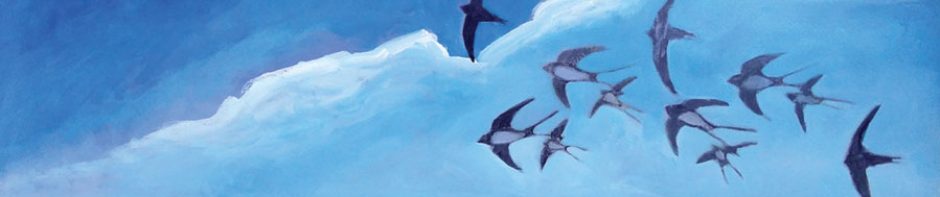
And two of my favorites, Minotaur and Stoss.
Minotaur  Stoss

Part of the great fun of these paintings is that they are BIG. I had a live-work loft in Oakland at the time, and tacked huge sheets of watercolor paper — that I bought by the roll — up on the wall. Here I am during Open Studios, standing in front of Palm Trees.
Me and Palm Trees

So what does this have to do with where I am today? Having dragged out and looked at some of my older work, I have noticed this:

Themes: line, motion, circles, cycles, myths, legends, ice, air, the wind, the intangible.

Color: I can see where the exploration of a limited palette led directly to the pleasures of working in black and white on linoleum. And when I put color back into prints, I go right back to the intense saturation of my painted landscapes. (This is not a bad thing.)

Going forward: My prints have been getting larger and larger, and this is a trend I want to continue. Last year I created a lot of prints with intense color; this is also something I want to get back to. And I want to continue to explore line and motion and even time in black and white.
And I want to get back to painting, too. I want a wall that I can tack paper on to and go wild. I want to sweep my whole arm to make a mark. I want to integrate my paintings and my prints in a sort of unified field theory.

I want to get back to work after a couple of months of shows and events. Stay tuned.

Posted in Art in General, Painting, Printmaking | Leave a comment

Movie Posters: Hit Puree!

While riding on the bus or subway, I often entertain friends (read “drive them crazy”) by critiquing the posters on display, and relating in great detail how I would design them differently. So I was very excited when offered the opportunity to review the new book by Matthew Chojnacki, Alternative Movie Posters from the Art Underground.

After praising early movie posters and their artistic value separate from the quality of the movies they represent, Chojnacki laments the fall of the poster during the 1990s. He writes in the book’s introduction, “The poster was reduced to simply communicating who was in the film, instead of conveying the bigger picture — the spirit of the film.”

This book, then, seeks to present alternative movie posters that are art in and of themselves, and that also capture the spirit of the film, not just the facts. It’s a tall order. Chojnacki describes the posters in the book as “masterpieces from across the globe, created by amazing and eclectic artists that share a common bond — mixing design and film in a blender, with stunning results.”

I’m not sure, in general, that mixing random things in a blender is a good idea, and that principle sometimes applies here as well.

Don’t get me wrong – a lot of these posters are great. I really like Maxime Pecourt’s poster for On the Road, which cleverly combines the single long page on which Kerouac wrote the novel with an image of a car on a winding road.
Poster for 'On the Road'

Chris Thornley’s vision for The Bourne Legacy conveys an unsettling sense of vertigo by setting the point of view from below, looking up through looming buildings, as a small figure jumps across the chasm of sky – which also forms a question mark. This is a compelling synthesis of storyline and emotional content, a definite capture of the spirit of the film.
Poster for 'The Bourne Legacy'

The Eraserhead poster by Adam Maida is appropriately gritty and unsettling.
Poster for 'Eraserhead'

I like this poster for Alien by Godmachine. It highlights the similarities between Ripley and the alien, here presenting them both encased in their carapaces. The comic-book style is well-suited to the science fiction movie.
Poster for Alien

And I am fond of Matthew Esparza’s poster for The Lost Boys, not just because the movie was filmed here in Santa Cruz, but also because the designer playfully uses the dark central area as both sky and ground, an anchor for the key elements and episodes pictured.
Poster for Lost Boys

Each poster in the book is accompanied by the designer’s name, contact information, and his or her answers to a few questions about such things as favorite movies, design influences, and preferred medium.

One disappointment I had in reading this book is that a lot of the posters are derivative. One can talk about one’s design influences, but I would hope a designer would take that as a jumping off point, not as a call to imitation. There are a lot of Mad Magazine influences, and Saul Bass has many, many design progeny.
The Bass-o-Matic

My second criticism is that, in many cases, Chojnacki almost does too good a job of pairing posters. On first read, I thought they were pairs of posters by the same artist. In fact, many are side-by-side examples of posters by different artists but with style and content so similar they seem to have been done by the same designer, and a designer who repeats the same ideas or images over and over at that. I would have preferred it if Chojnacki had chosen a complete hodgepodge of posters, showing the breadth of the alternative movie poster movement, rather than trying to highlight similarities. Or, to further his blender analogy, if he had gone all the way to puree.

Still, these are quibbles. If you are a movie fan, if you are a poster fan, or if you’re a fan of interesting design, and especially if you’re all three, this book is well worth taking a look at. I find it improves with repeated visits, since there is just so much visual information.

Alternative Movie Posters
Alternative Movie Posters: Film Art from the Underground will be published by Schiffer Publishing on October 28, 2013.

Posted in Reviews | Leave a comment

Just one more print before Open Studios…

Santa Cruz’s annual Open Studios tour opens this weekend, and, as usual, I wanted to squeeze in just one more print before I set up my space for guests. This year, it was quite a squeeze, as I started the edition of my biggest print ever!

How big is it? The image itself is 36″ x 16″, the paper is 40″ x 20″. It just barely fit onto my press, and I had to do the inking outside in the yard because the setup wouldn’t fit in the studio.

Here’s the inking station. The small table in the back is where I rolled the ink with the brayers. The table on the left is where I inked the block, and the table on the right contains a stack of clean ready-for-printing paper. All protected by newsprint in case birds flew over.
Working outside

Bob helps.
Bob helps

Here’s the print on the press. Note that the roller has to be lifted up above the block. I had to slide the paper carefully between the roller and the inked block before gently (and accurately) lowering it into place. A proof is drying on the cabinet door in the background.
The block on the press

And, since the roller came down just barely past the block, I gave the paper a quick hand burnishing after running it through the press, especially around the edges, just to make sure. Better safe than sorry! I’m using a brass apothecary’s pestle – its weight and smooth head make it a great tool for burnishing.
Extra burnishing

The final print, hanging to dry. Large heavy paper needs many clothespins!

This is “La Penitente”.
La Penitente

And, just to give a graphic idea of the scale, until this year the largest linoleum blocks I had carved and printed were 8″ x 6″ – the size of ‘The Graeae,’ hanging to the right of the two penitentes prints.
Scale comparison

See these and more this weekend!
My studio will be open to the public during Santa Cruz Open Studios.
October 5 & 6 and October 19 & 2o
11am – 5pm each day
816 Hanover Street, Santa Cruz (see map)

Posted in Printmaking | 4 Comments